
After giving a quick KLWP oversight the next step is to create a preset or wall. This part will give you all the information that you need for creating KLWP Presets.
Kustom Beginner’s Guide – Part 2 – Creating KLWP Presets
After part 1 of the Kustom Beginner's Guide it took me some time to plan this series. I was trying to find a way of arranging all advanced parts into an easy understandable structure. My decision is to start showing how you create a simple Wall and I will add more advanced features to this wall with every part of this series.
Creating a new Preset
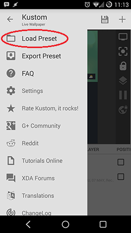
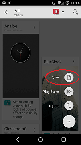
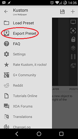
To start open the hamburger menu and click "Load Preset" and afterwards pick "+" to open the FAB menu for adding presets.
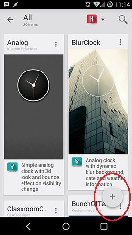
Now pick "new" and you end up with a new and empty preset. After that all the magic can start.
Preset Design
I will base my tutorial preset on Matte by +Fritz Franke, go check out his nice walls on G+!
The sole purpose of my preset is to show you easy designing steps, it won't beautiful or very useful.
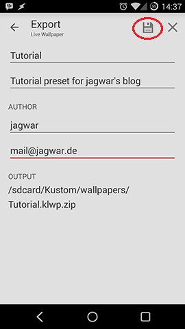
Be very careful while creating KLWP presets, Kustom has no (!!!) auto-save! With applying your preset to the background (save symbol top right) you don't save it! Please save your designs often, to do so open the menu and pick "Export Preset". Now fill in all your data and save!
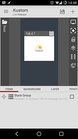
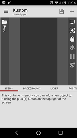
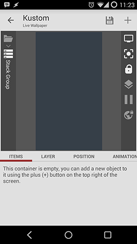
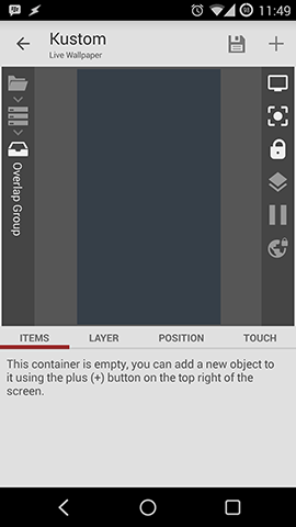
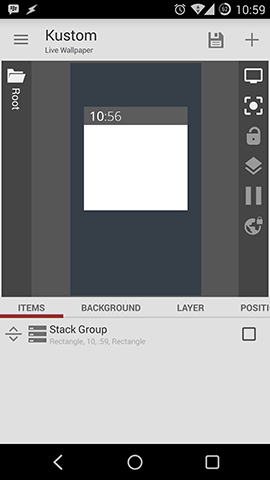
The root layer
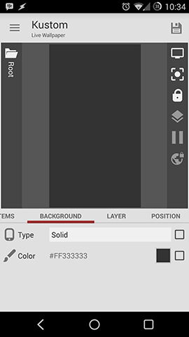
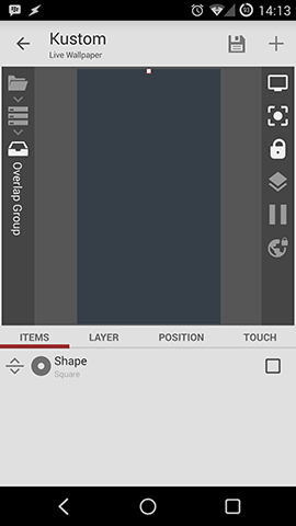
In the root layer of your preset you have several options at the bottom of the screen. First is a self-explaining list of your items, which right now is empty in my preset.
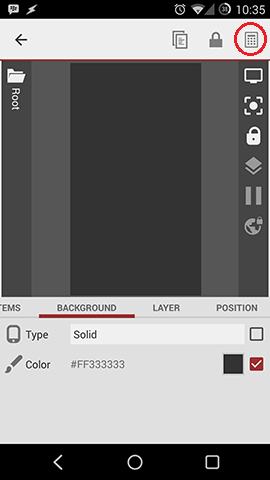
Background
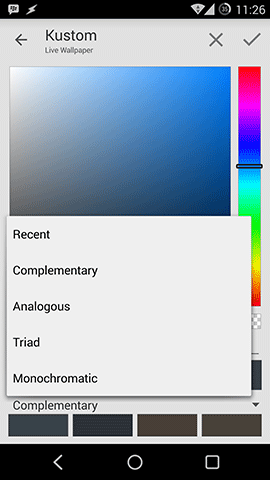
The next field is the background. By default the type is "solid" which means a single color, you can change that color by pressing on the field and the color picker shows up.
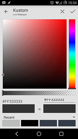
You can pick from recent colors, adjust opacity and open a menu which gives you complementary, analogous, triad or monochromatic colors.
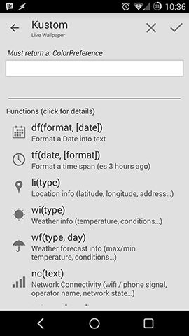
Also functions can be used to define the color. To do so you have to check the square next to the color on pick the "Advanced Editor" on the top right. Afterwards the functions editor is opened by clicking on the color field.
There will be a special, more detailed post for functions in the Kustom Beginner's Guide.
The other possible type for your background is images. I think the fields and options are pretty self-explaining. Make sure to play around with "Blur" etc...
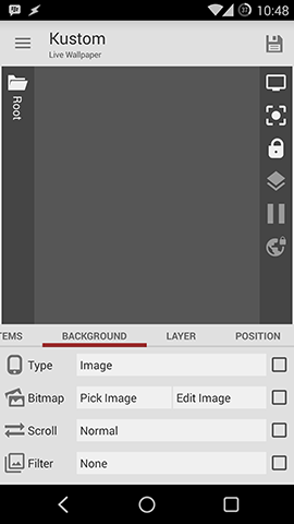
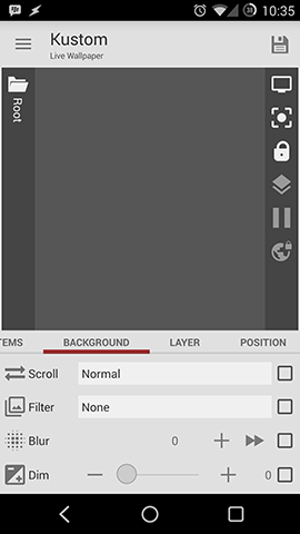
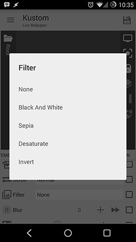
You also can apply filters like "Black and White", "Sepia", "Desaturation" and "Invert" with adjustable values to your image.
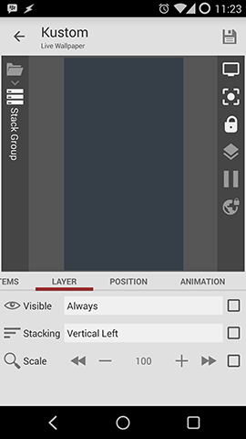
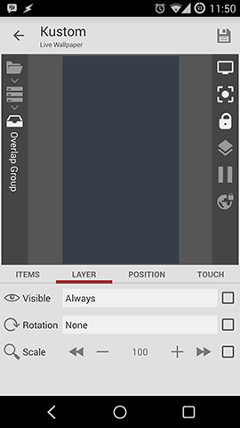
Layer
In the layer field you can adjust visibility and scale your whole preset.
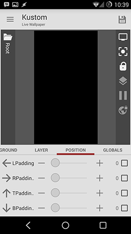
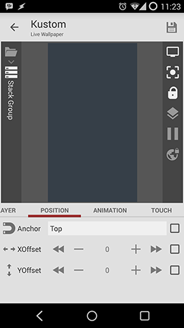
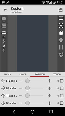
Position
In the position field you can reposition your whole preset. Say you have a small preset in the middle and want to move it around, this is the way you do it.
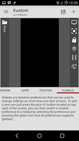
Globals
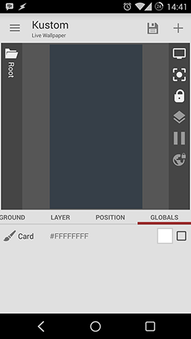
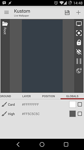
The last field is Globals. I have explained globals in the first part of this guides and I will have a more detailed post for Globals in the Kustom Beginner's Guide. For now I want to add 2 Globals that define colors.
For that press "add", give the global a name "Card" and press "ok".
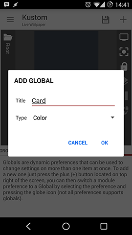
Now you can assign a color via the color picker as described in the background section. After picking your color (I went with white) add a second Global with a different color.
Adding items to the preset
Finally it's time to start creating the preset. In the Basics part of the Kustom Beginner’s Guide I showed you how to add items.
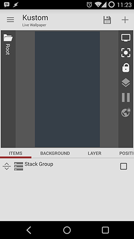
Stack Groups
For this preset first add a stack group and click on it to go in the stack group layer. The stack group will make it easier to design the cards for our version of matte.
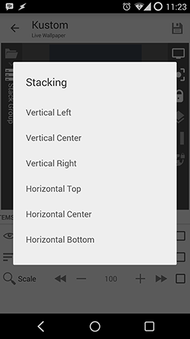
In the layer field you can again define visibility and now the way of stacking. For our preset you can leave it at "Vertical Left". I think the options are self-explaining.
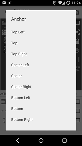
The position field looks a little different now, too. By defining X and Y Offset you can position your Stack Group. Anchor comes in handy if you want to align your Stack Group differently and not create crazy high offsets.
The animation field is new. For now we will leave this empty and have a look at in in a more detailed post on animations.
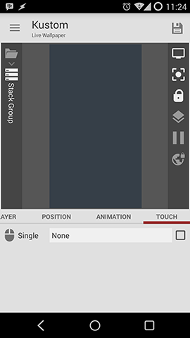
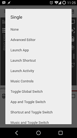
The touch field is the OnTap function of Kustom. Here you can define what happens if you touch the Stack Group. You have a lot of options and I think the most used are "Launch App" and "Music Controls".
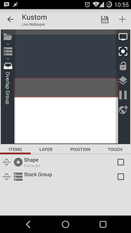
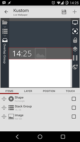
Overlap Groups
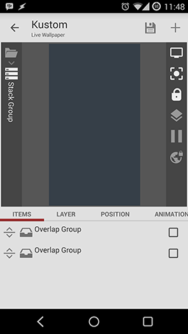
The next step in our Creating KLWP Presets guide is to add 2 Overlap Groups. Each Overlap Group will be one card for our design and contain all the text and icons.
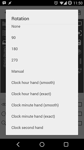
Note: The Overlap group is the third layer and has other options than second layer groups (no animations for example).
In the layer field you can again adjust visibility and now new, "Rotation". This can be used to make clock hands!
In the position field you can adjust padding. More on that later, because now with this empty groups it has no function.
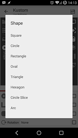
Shapes
The next step in our Creating KLWP Presets guide is to add shapes to our preset. To do so go into the first Overlap Group and add a shape. Click the shape and you are presented with some options.
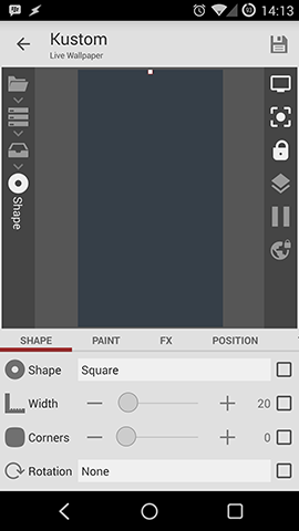
Here you can pick your shape form. I will go with "Rectangle" for my preset.
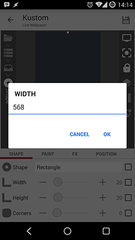
Size can be adjusted with width and height by moving the dot or my inputting a number after clicking on the field.
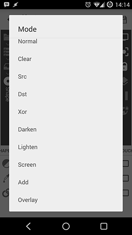
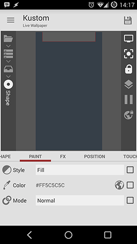
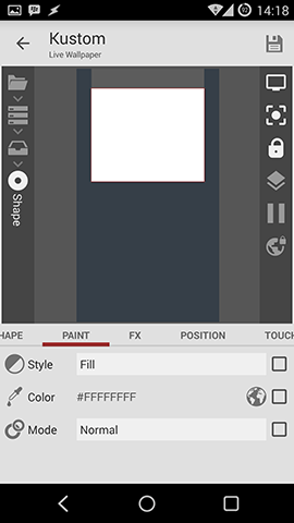
The next options for your shape are "Paint". Here you can pick a color or Drawing Mode like "Xor".
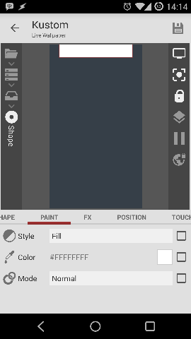
For our preset I want to use global colors. To do so you have to mark the color field and press on the Globals Button on the top right (globe). Afterwards you can pick your global by opening the menu with touch on the color. For this card I picked "high".

Your color should now look like this.
The next options you can adjust is FX (effects).
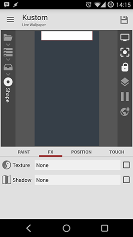
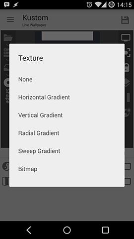
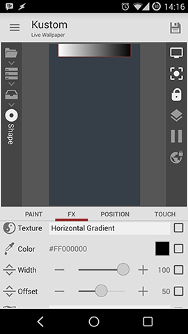
Texture gives you the possibility to add gradients or bitmaps to your shape. Play around with the settings to get to know the different possibilities. I think it is self-explaining.
Also it is possible to add an outer Shadow with adjustable settings.
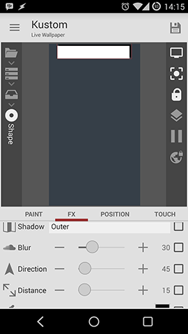
For our preset you don't need to do all that.
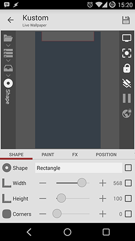
Now just go into the second overlay group and add a rectangle shape with 568x468 and the global "card" as color.
Now the basic card design is finished.

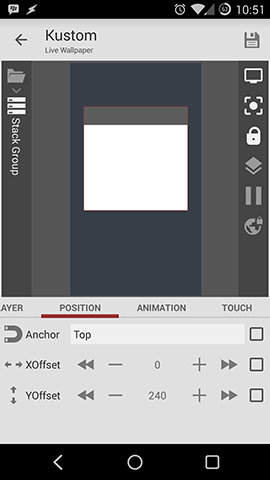
Now to make the design more screen friendly go into the Stack Group and adjust the YOffset to 240.
Adding Text
The next step will be to add a digital clock to the highlight card.
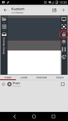
To have a better view you can unlock the Preview window. After that Kustom will zoom into your editing area.
I want the clock to be a little special: The hours should have a different format than the minutes. In Zooper it was possible to do something like that with advanced parameters. When creating KLWP Presets you can't do that. There is an easy way to go around this. You put your text into a vertical stack group. By doing that you can align as many text items as you like and move them around together which makes stuff really easy.
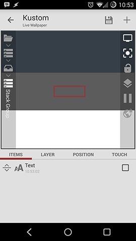
To do so add a Stack Group to your first Overlap Group.
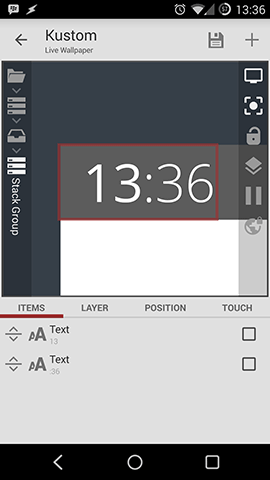
In the Stack Group add a text item.
Text items offer a lot of options.
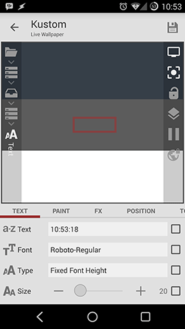
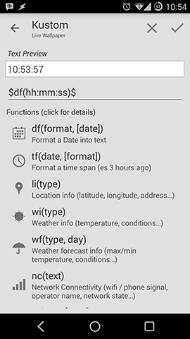
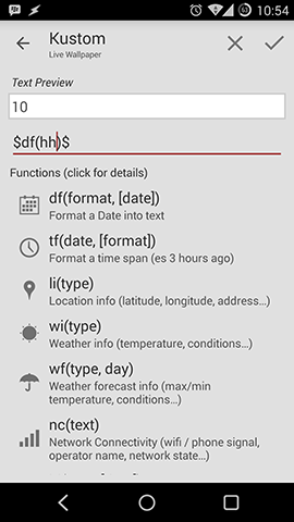
To edit the text item press on "text" and the editor opens. Here you can use functions and so on. For this part of the clock you'll just need the function "$df(hh)$" for hours.
Adding Fonts to KLWP
As you can see in the following pictures I will use two custom fonts for this preset. You can download these Open Sans fonts here. To be able to use them you will have to add them to your /Kustom/fonts folder. Just copy them with a file explorer into this folder.
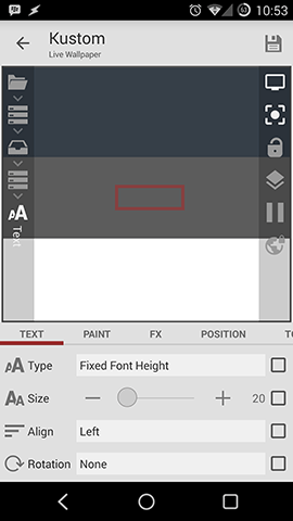
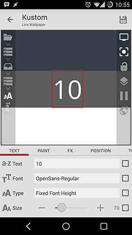
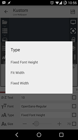
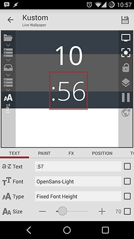
Now you can adjust the text settings. I changed the size to 70. As you can see in the right picture you can change the size type of your text so that the height or width of your text is fixed.
In my preset right now you can't make the size bigger than 70 and in the next steps I will explain why.
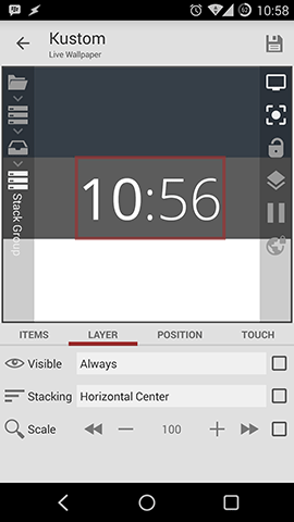
No you have to add a second text item to this Stack Group and after changing the function to just show ":minutes", adjusting font and size you will end up with the left picture. Now you have to change the Stacking to "Horizontal" to make a useful clock.
As you can see the size of the "wrong stacked"Stack Group has enlarged the size of the Overlap Group and so the first Stack Group with just the cards is now changed, too. This would also happen if you would have picked a font size bigger than 70.
Long story short: If you use my organized structure you can't make the font size as big as you like, because it would crash the Stack Group. Text items in Kustom have always interior margins and right now you can't adjust them.
If you want to make the text item bigger you will have to just put the items over each other without using this group structure. By this you will loose a lot of easy editing when creating KLWP presets.
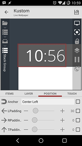
Now the clock is centred inside your highlight card. I want to have on the left side so go to position and change the anchor to "Center left".
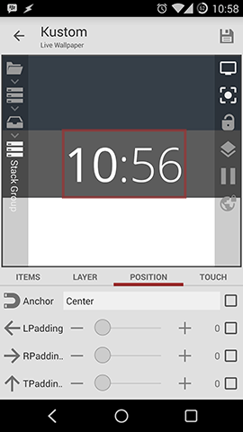
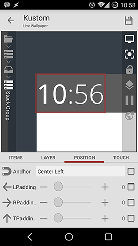
To make the design more appealing you can adjust the "left Padding" and move the clock a little bit to the right.
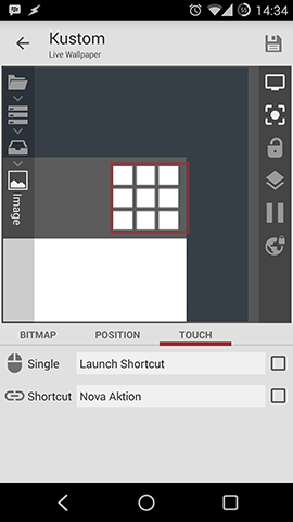
Additionally you can a touch action like opening the Clock App.
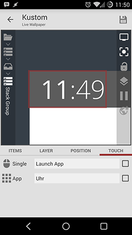
Now the clock is interactive and finished. It should look like this and the whole preset like the right picture.
Adding images
The next step in this guide about creating KLWP presets is to add an image to the top card. To do so go into the Overlap Group of the top card and add the image item.
Afterwards click "pick image" and choose your image. (download my image)
Note: I created a folder with all my KLWP images (/Kustom/Images) which I sync with Dropbox via Dropsync. You don't need to do that but it makes things very easy.
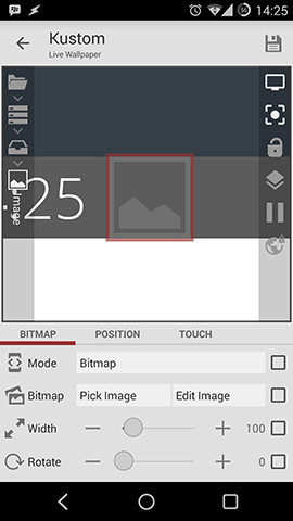
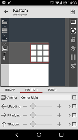
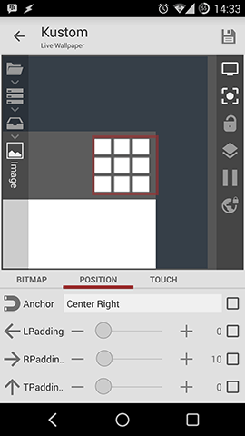
Reduce the width to 80 and set the anchor to "Center right".
After adding some right padding assign your App Drawer to open on touch with this image.
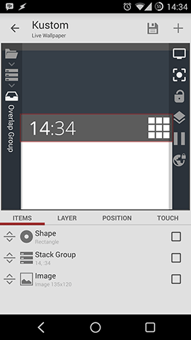
Your finished Overlap Group should look like this.
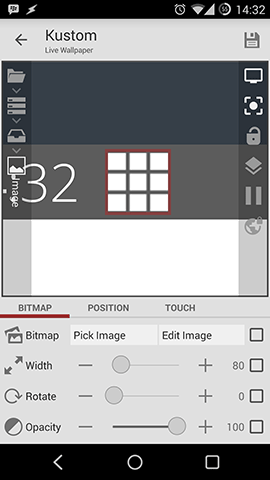
Adding Weather Komponents
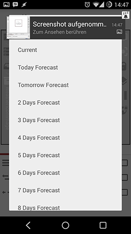
Now go to the lower Overlap Group. Here I want to add a weather komponent. After doing that you can pick what forecast you'll like to see. Also you can switch night icons on or off.
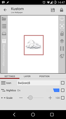
Since the size of the weather icons is not that big you can scale them to 200.
For now this KLWP preset is finished and should look like the right picture.